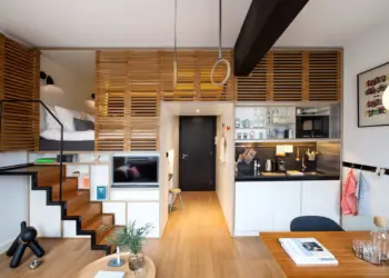
The Analogous Color Scheme is a fundamental concept in interior design, offering a versatile approach to creating visually pleasing and harmonious spaces. By harnessing the power of colors that are adjacent to each other on the color wheel, designers can achieve a cohesive and balanced aesthetic that transforms any room into a captivating and inviting environment. Here’s how to implement it effectively
Table of Contents
The Basics of Analogous Colors
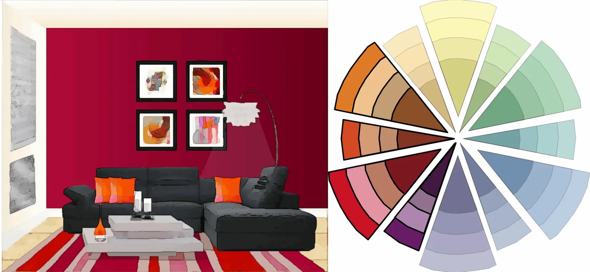
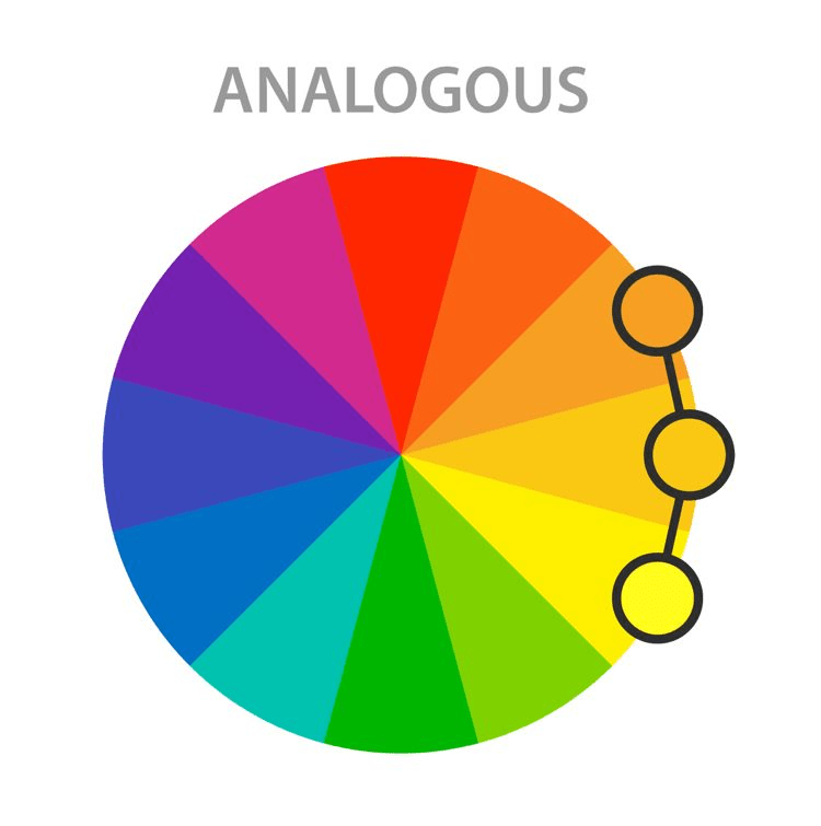
Analogous colors are hues that share a common base color and are located next to each other on the color wheel. This color scheme creates a sense of unity and harmony, offering a seamless transition between shades while maintaining a visually appealing balance. Understanding the theory and application of analogous colors is essential for effectively implementing this design concept in interior spaces.
Implementing Analogous Colors in Interior Design
Incorporating analogous colors in interior design involves a strategic blend of primary, secondary, and tertiary hues to create a cohesive and engaging color palette. Whether through wall paints, furniture upholstery, decor accents, or textile choices, the careful selection and placement of analogous colors can significantly influence the overall ambiance and atmosphere of a room, reflecting a sense of sophistication and aesthetic finesse.
Creating Harmonious Spaces
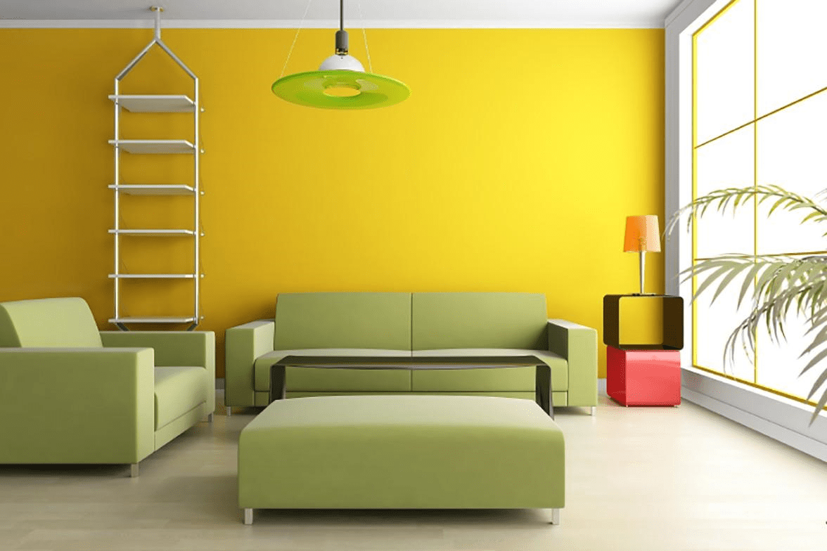
Achieving a harmonious balance within a space involves skillfully blending analogous colors to evoke a sense of tranquility and unity. By selecting colors that complement each other and maintaining a consistent tonal progression, designers can create a seamless flow that enhances the visual appeal of the room while promoting a relaxing and inviting environment for inhabitants and guests alike.
Analogous Colors for Different Room Types
Tailoring analogous color schemes to specific room types requires an understanding of the unique characteristics and functionalities of each space. Whether it’s the living room, bedroom, kitchen, or study, each room demands a distinct approach to color selection and coordination, ensuring that the chosen color scheme aligns with the room’s purpose and intended atmosphere.
Analogous Colors examples Combinations
Inspiring design palettes serve as valuable references for homeowners and designers seeking to experiment with analogous color schemes. From subtle earthy tones to vibrant and energetic hues, various examples illustrate the versatility and adaptability of analogous colors, showcasing their potential to transform any space into a captivating and aesthetically appealing sanctuary.
Adding Accents and Contrasts
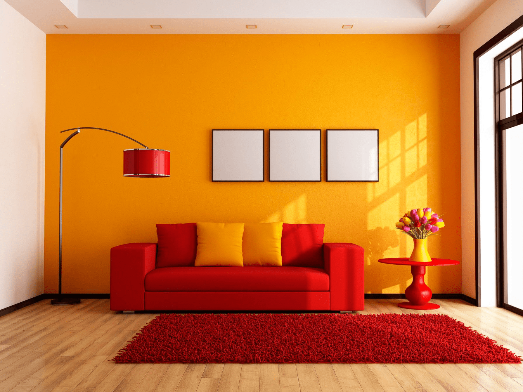
Elevating an analogous color scheme involves the strategic introduction of contrasting elements and accent colors to prevent monotony and add depth to the design. By incorporating complementary hues, textures, and patterns, designers can create focal points and visual interest, infusing the space with a dynamic and engaging atmosphere that stimulates the senses and captivates the beholder.
Maximizing Light and Space
Utilizing the inherent properties of analogous colors can help maximize the perception of light and space within a room. Lighter tones and shades can create an illusion of expansiveness and airiness, while darker hues can add depth and intimacy. By strategically manipulating color intensity and contrast, designers can alter the perceived dimensions of a room, making it appear more spacious, cozy, or vibrant, depending on the desired effect.
Using Textures and Patterns
The integration of textures and patterns complements the analogous color scheme, offering an opportunity to introduce tactile and visual diversity. By combining smooth and rough surfaces, matte and glossy finishes, and intricate or minimalist patterns, designers can enhance the depth and character of a space, creating a multi-dimensional visual experience that stimulates the senses and adds layers of complexity to the overall design narrative.
Customizing the Scheme to Personal Style
Infusing individual aesthetics into an analogous color scheme allows homeowners to create personalized and distinctive spaces that reflect their unique personalities and preferences. By incorporating elements of personal style, such as artwork, decor accents, or customized furnishings, individuals can establish a more intimate and emotionally resonant connection with their living environment, fostering a sense of belonging and identity within the space.
Psychological Impact of Analogous Colors
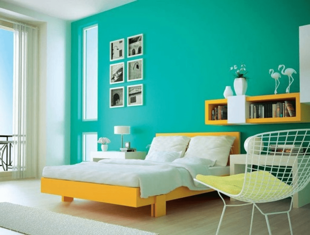
Understanding the psychological influence of analogous colors is crucial for creating atmospheres that evoke specific emotions and moods. While warm analogous colors can promote feelings of comfort, coziness, and intimacy, cooler tones can instill a sense of calm, tranquility, and serenity. By harnessing the psychological impact of colors, designers can curate environments that cater to specific emotional needs and desires, fostering a more immersive and enriching experience for inhabitants and visitors.
Dos and Don’ts of Analogous Color Schemes
Effective implementation of analogous color schemes requires adherence to certain best practices while avoiding common pitfalls. By following guidelines related to color balance, proportion, and coordination, designers can ensure a visually appealing and cohesive design outcome, while also steering clear of over-saturation, monotony, or jarring color clashes that could undermine the intended aesthetic effect.

Overcoming Challenges in Implementation
Troubleshooting tips play a vital role in addressing challenges that may arise during the implementation of an analogous color scheme. Whether it’s dealing with limited natural light, accommodating existing architectural features, or incorporating pre-existing furniture and decor elements, designers can employ creative solutions and adaptive strategies to overcome obstacles and achieve a harmonious and visually striking design outcome.
Famous Interior Designs Using Analogous Schemes
Examining noteworthy examples of interior designs that have successfully incorporated analogous color schemes provides valuable insights and inspiration for aspiring designers and homeowners. From iconic architectural marvels to renowned residential spaces, these examples showcase the timeless allure and enduring impact of analogous colors, highlighting their role in shaping the narrative and ambiance of interior environments through the seamless integration of color and design principles.
Experimenting with Modern Twists
Contemporary adaptations and innovations in the use of analogous color schemes demonstrate the ever-evolving nature of interior design and its responsiveness to changing trends and preferences. By exploring modern twists on traditional color schemes, designers can push the boundaries of creative expression and foster a more dynamic and engaging design landscape, fostering a spirit of innovation and experimentation that redefines the possibilities of interior decor in the modern era.
FAQs
What is an analogous color scheme?
An analogous color scheme refers to using colors that are adjacent to each other on the color wheel, creating a harmonious and unified visual effect.s
What are the 4 analogous colors?
The four analogous colors are those that are next to each other on the color wheel, such as red, red-orange, orange, and yellow-orange.
How do you identify analogous?
To identify analogous colors, you can refer to the color wheel and select colors that are positioned next to each other. These colors will share a similar undertone and blend seamlessly when used together in a design or composition.
What is neutral and analogous color scheme?
A neutral and analogous color scheme combines analogous colors with neutral tones like beige, gray, or ivory to create a balanced and subdued color palette.
What is an example of an analogous color in art?
An example of an analogous color in art could be a painting featuring various shades of green, blue-green, and blue, representing a natural landscape.
Where are analogous Colours found?
Analogous colors are commonly found in nature, art, and various design elements. They can be observed in natural landscapes, floral arrangements, and even in the color schemes of interior and graphic designs.
What is the difference between analogous and monochromatic colors?
The difference between analogous and monochromatic colors lies in the number of hues used. While analogous colors are adjacent on the color wheel, monochromatic colors are variations of the same hue.
What are three analogous examples?
Three analogous color examples include blue, blue-green, and green; orange, yellow-orange, and yellow; and violet, red-violet, and red.
