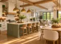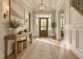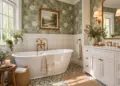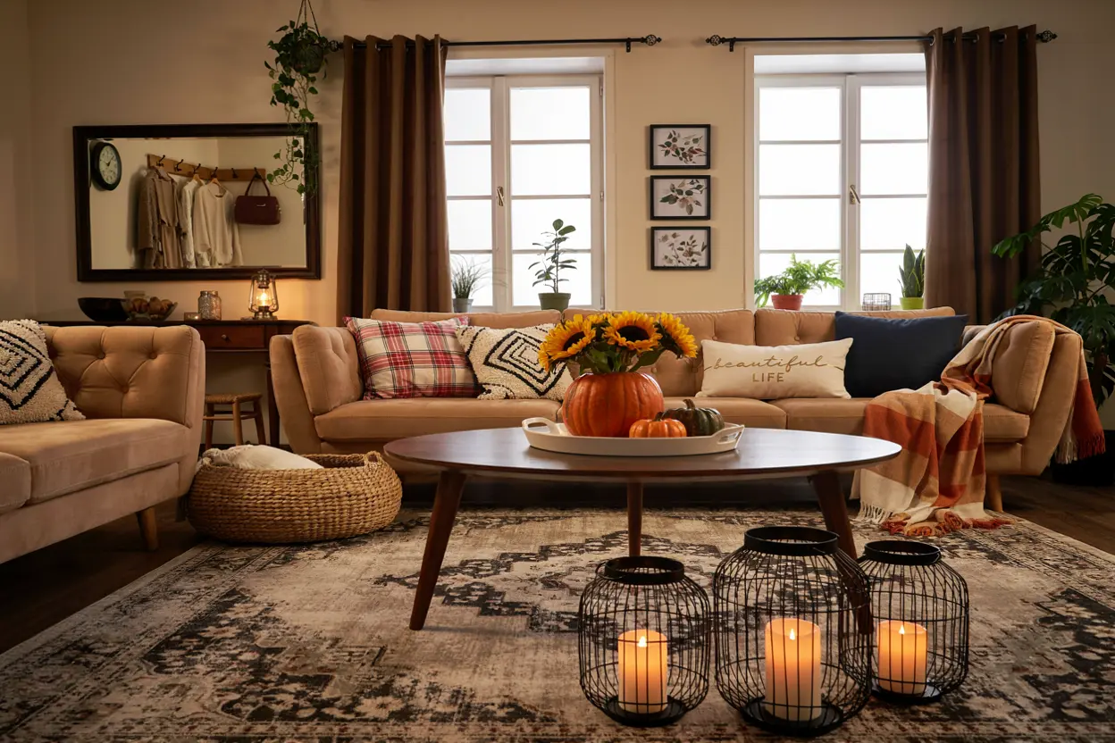
Fall is the perfect season to rethink your home’s color palette. As the light becomes softer and interiors start to feel cozier, color can completely change the mood of a living room without requiring a full renovation.
The fall 2026 living room color palette is moving toward rich, grounded shades that feel sophisticated but still comfortable. Instead of relying only on beige and gray, designers are embracing wine red, burgundy, olive, layered greens, smoky blue, chocolate brown, warm cream and earthy terracotta.
The exciting part is that these colors don’t have to dominate an entire room. A single accent chair, velvet cushion, painted wall, rug or piece of artwork can introduce a fashionable shade without making the space feel overwhelming.
This guide explores the top 8 fall 2026 living room color trends, explains how to use each shade, and shows how to combine them for a warm, modern and timeless interior.
For more fall decor ideas chuck our 25+ Front Porch Fall Decor Ideas.
Table of Contents
Warm vs. Cool Fall Colors
Before choosing a trendy shade, consider the existing colors in your room.
A north-facing room may receive cooler natural light, so warm shades such as:
- Wine red
- Burgundy
- Chocolate brown
- Terracotta
- Warm cream
can help create a welcoming atmosphere.
A room with strong southern or western light may work beautifully with:
- Olive green
- Layered greens
- Smoky blue
- Soft beige
- Muted taupe
Don’t forget to look at your flooring, sofa, curtains and large furniture pieces before choosing paint. A color that looks gorgeous online can look completely different beside your existing wood tone or upholstery.
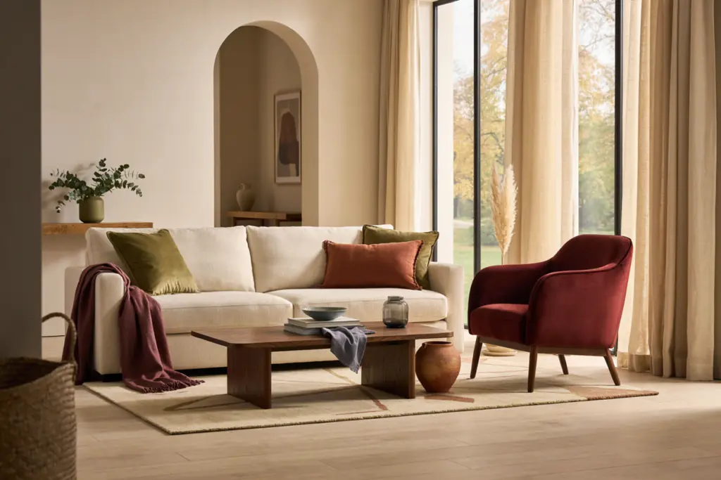
Wine Red: The Statement Color of Fall 2026
Wine red is one of the most sophisticated choices for a fall living room. It’s deeper than traditional red and warmer than many burgundy shades, giving it a luxurious quality without feeling overly festive.
The beauty of wine red is its versatility. It can work in traditional homes, modern apartments, vintage-inspired spaces and even minimalist rooms.
How to Use Wine Red
You don’t necessarily need a wine-red wall.
For a subtle update, introduce the shade through:
- Velvet throw pillows
- A textured area rug
- Curtains
- Artwork
- An accent chair
- Decorative ceramics
- A statement ottoman
- A cozy throw blanket
If you love dramatic interiors, consider painting one feature wall in a muted wine shade.
Best Colors to Pair With Wine Red
Wine red looks particularly beautiful beside warm neutrals.
Try combining it with:
Wine red + warm cream: Elegant and soft.
Wine red + chocolate brown: Deep, cozy and luxurious.
Wine red + olive green: Rich and nature-inspired.
Wine red + brass: Sophisticated and slightly glamorous.
Wine red + natural wood: Warm and approachable.
One mistake to avoid is pairing too many equally dark colors. If wine red is your statement shade, introduce lighter elements to give the eye somewhere to rest.
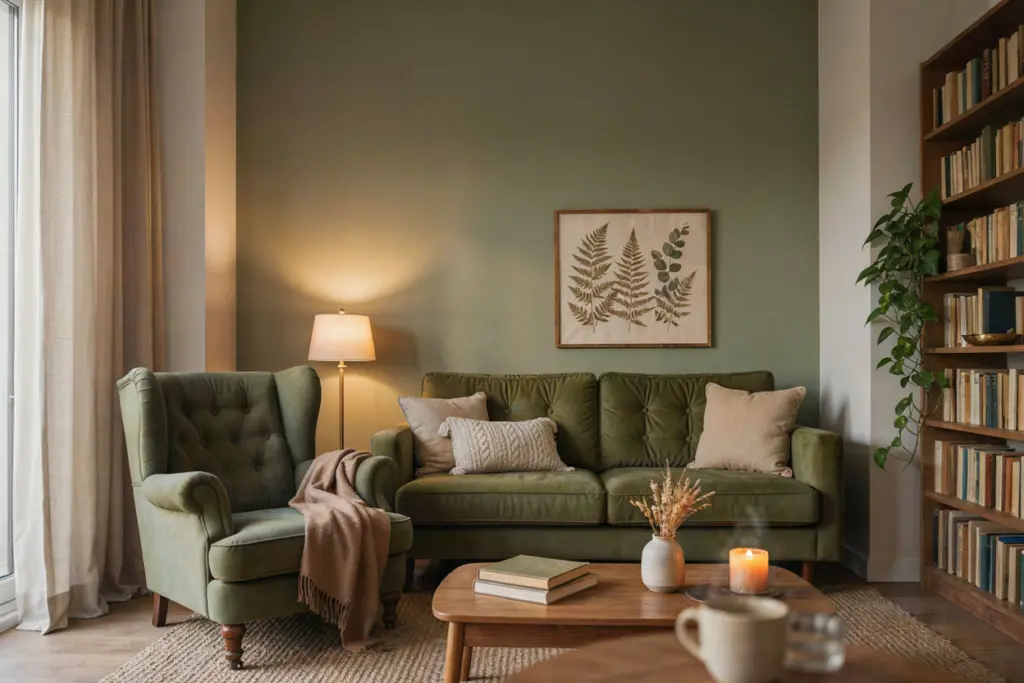
Olive Green: Natural Sophistication
Olive green continues to be one of the easiest colors to bring into an autumn interior because it feels both earthy and refined.
Unlike brighter greens, olive has a muted quality that works well with natural materials. It can make a living room feel connected to nature without turning it into a jungle-themed space.
Decorating With Olive
Olive green works particularly well on:
- Accent walls
- Sofas
- Armchairs
- Curtains
- Cushions
- Bookshelves
- Cabinetry
- Large botanical artwork
For a sophisticated look, combine olive with warm white walls, oak furniture and aged brass details.
If painting an entire room feels intimidating, start with an olive accent chair or a pair of cushions. You can always build from there.
Olive also works beautifully with beige and tan. These combinations are particularly useful if you already have a neutral sofa.
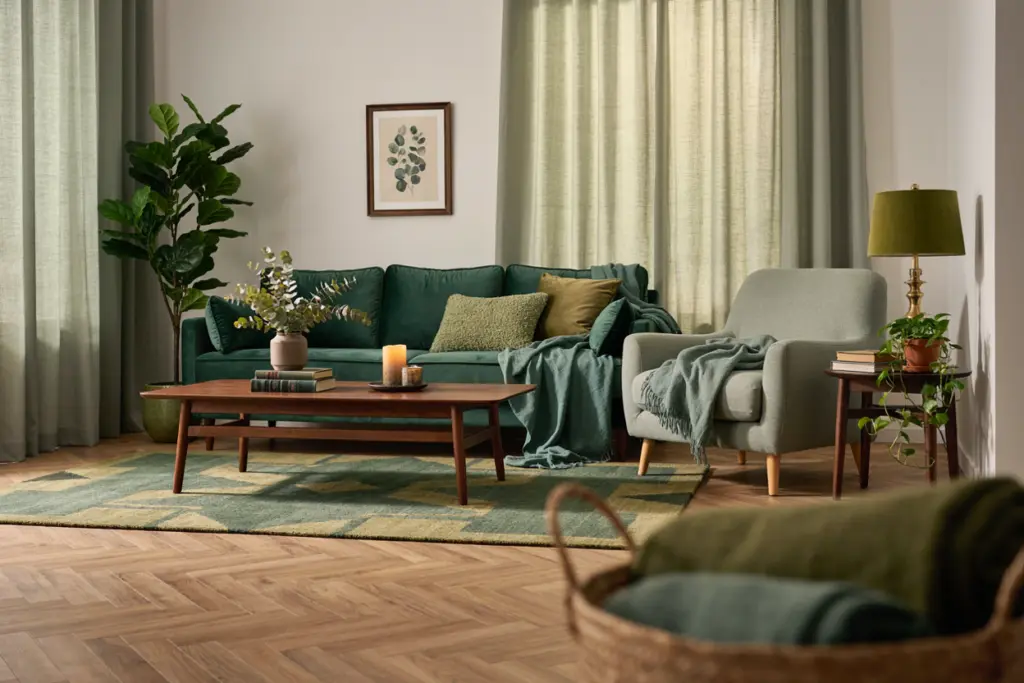
Layered Greens: A Fresh Take on the Green Trend
Rather than choosing one green and using it everywhere, layered greens create a more sophisticated and natural-looking room.
This approach involves combining several related shades, such as:
- Soft sage
- Olive
- Moss
- Forest green
- Deep eucalyptus
- Muted emerald
The result feels richer because the room doesn’t depend on one flat color.
Creating a Layered Green Palette
Start with one dominant shade.
For example, imagine an olive-green accent wall. Add a sage cushion, a moss-colored throw and a deeper forest-green vase.
Then introduce natural textures.
Wood, linen, rattan, stone and woven materials help prevent a green palette from feeling too heavy.
The trick is to vary both color and texture.
A velvet green cushion beside a linen green cushion will look much more interesting than two identical green fabrics.
Layered greens also work wonderfully with houseplants. Even if your furniture remains neutral, plants can reinforce the organic feeling of the palette.
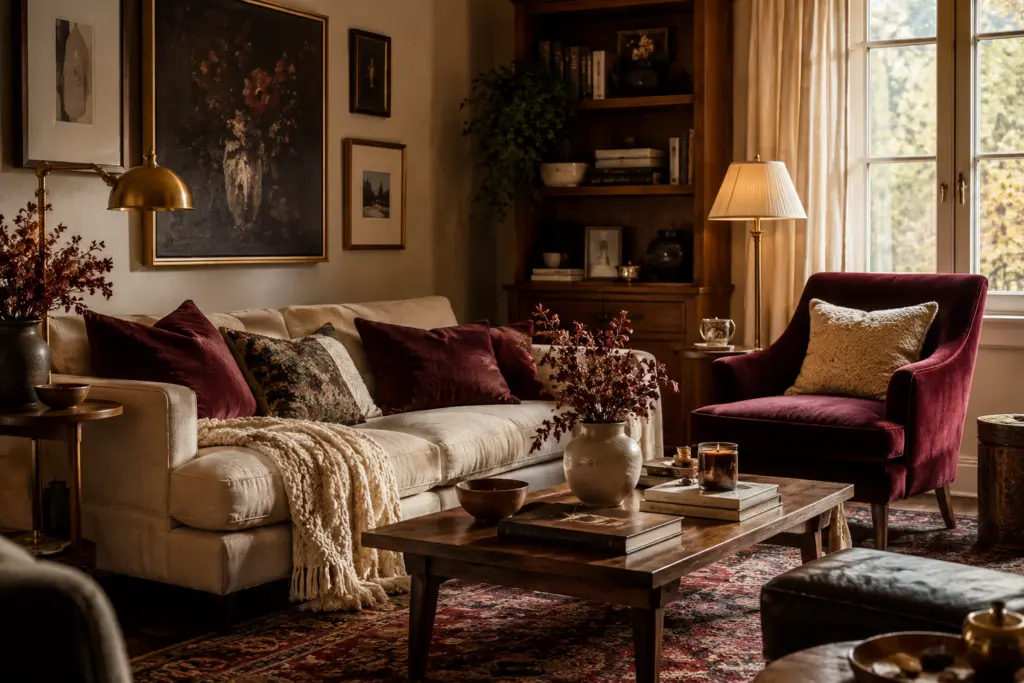
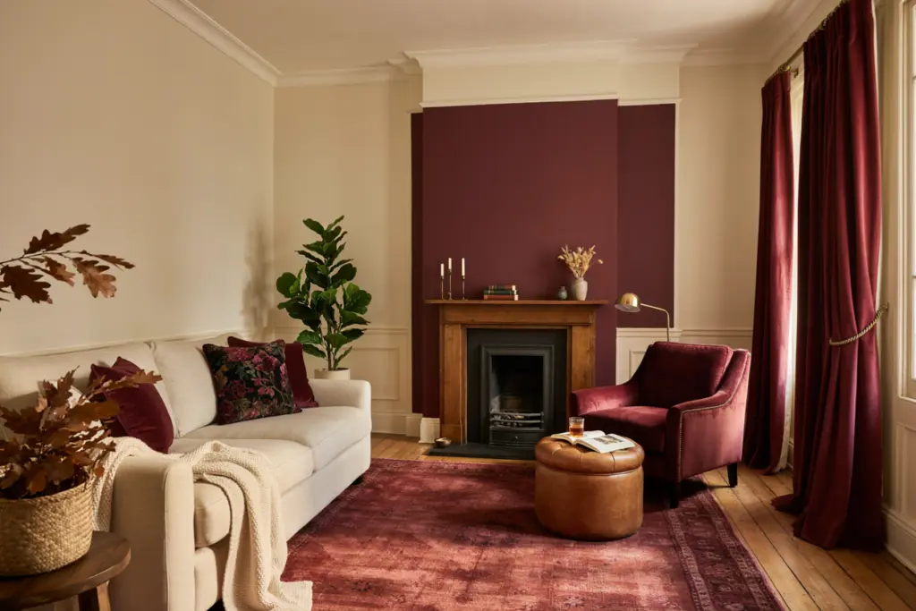
Burgundy: Deep, Dramatic and Elegant
Burgundy is another standout shade for fall 2026. While wine red can feel slightly softer and more sophisticated, burgundy has a darker, moodier personality.
It’s perfect for homeowners who want their living room to feel intimate and dramatic.
Burgundy Accent Ideas
If you’re unsure about committing to burgundy, start small.
A burgundy sofa cushion can instantly warm up a cream sofa. A burgundy rug can become the visual anchor of a neutral living room.
For a more dramatic effect, consider:
- Burgundy curtains
- A burgundy accent chair
- A painted fireplace wall
- Burgundy artwork
- A leather ottoman
- Dark floral cushions
Burgundy looks particularly beautiful with creamy white rather than stark white.
For a luxurious effect, add walnut wood and small touches of brass.
Smoky Blue: Moody but Calming
Not every fall color needs to be warm.
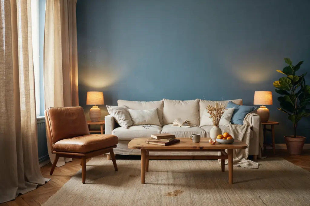
Smoky blue offers a cooler alternative for homeowners who want a calm, sophisticated living room. Its gray undertone makes it easier to use than bright blue.
How to Warm Up Smoky Blue
The biggest challenge with cool colors is preventing the room from feeling cold.
The solution is simple: add warmth through materials.
Combine smoky blue with:
- Natural oak
- Walnut
- Cream
- Camel
- Tan leather
- Warm lighting
- Woven textiles
A smoky-blue wall with a cream sofa and wooden coffee table can look incredibly sophisticated.
For smaller rooms, consider using smoky blue in furniture or accessories rather than covering every wall.
Chocolate Brown: The Cozy Neutral
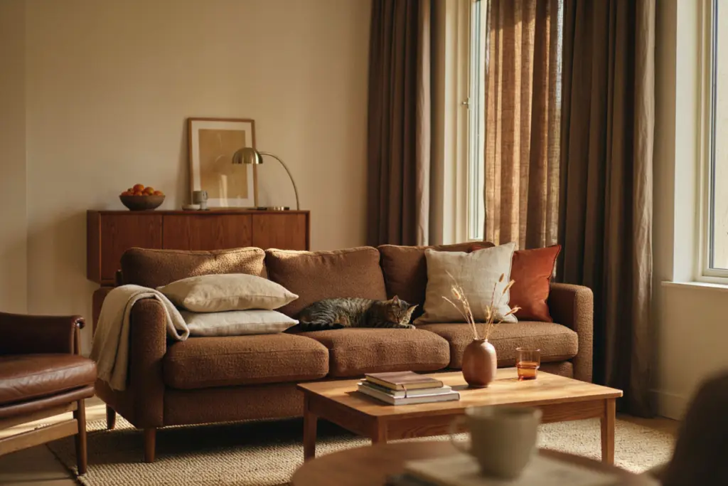
Brown is having a major moment in modern interiors because it provides something that many cool neutrals lack: warmth.
Chocolate brown can make a living room feel grounded, comfortable and sophisticated.
Modern Ways to Use Brown
The secret to avoiding an old-fashioned appearance is pairing brown with contemporary shapes and lighter materials.
Try:
- A chocolate-brown sofa
- Brown leather seating
- Walnut furniture
- Dark brown curtains
- Brown ceramic accessories
- Chocolate-colored cushions
Then balance the darker shade with cream, oatmeal or light beige.
A chocolate-brown sofa surrounded by cream cushions and natural wood furniture can look modern rather than heavy.
Texture is also important. Velvet, boucle, leather, linen and wool create visual variety even when the color palette is simple.
Warm Cream and Oatmeal: The Perfect Foundation
While richer colors are becoming more popular, neutral shades aren’t disappearing.
They’re simply becoming warmer.
Warm cream and oatmeal are excellent foundation colors for fall 2026 because they allow stronger shades to stand out without making the room chaotic.
Layering Warm Neutrals
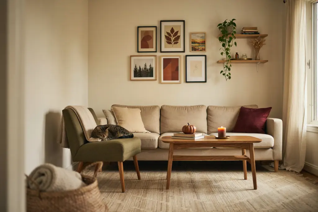
Instead of using one beige shade throughout the entire room, combine several close tones.
For example:
- Warm cream walls
- Oatmeal sofa
- Beige rug
- Light tan cushions
- Natural wood coffee table
- Off-white curtains
Then add one or two stronger colors.
A burgundy cushion or olive chair can completely transform the space.
This approach is especially useful for renters because accessories can create the trend without permanent changes.
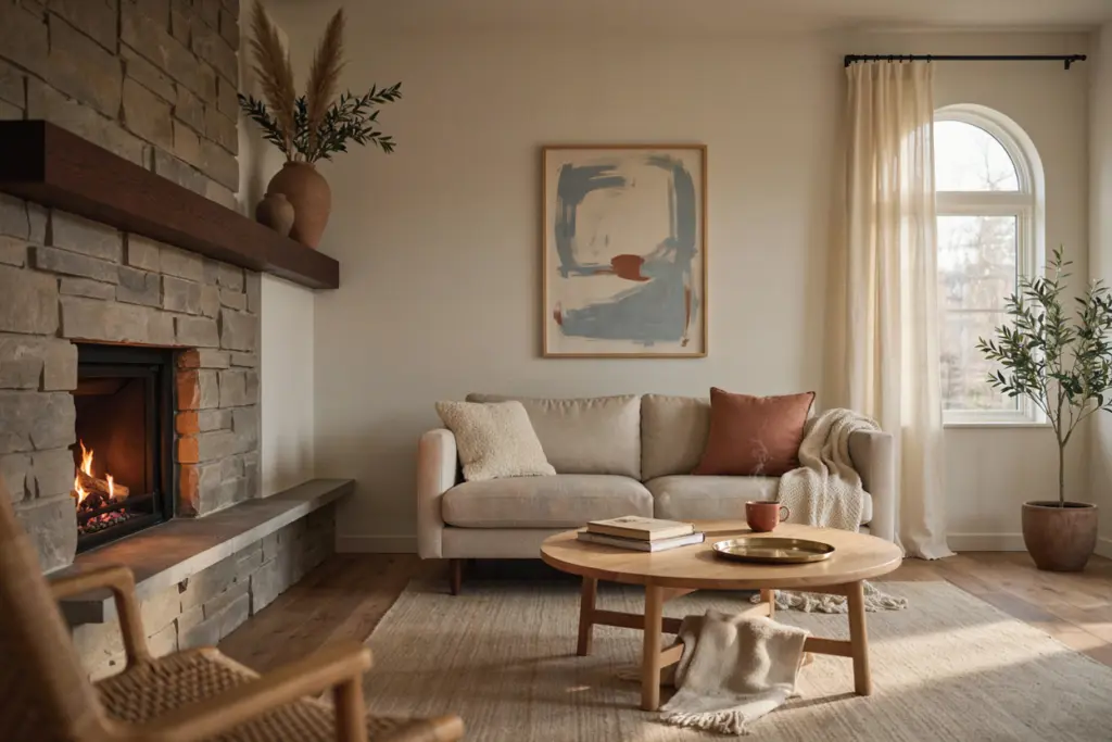
Burnt Terracotta: Earthy Seasonal Warmth
Burnt terracotta brings an unmistakable autumn feeling into a living room.
It’s warmer than traditional orange and softer than bright rust. When used correctly, it can create an earthy and sophisticated atmosphere.
Pairing Terracotta Successfully
Terracotta works especially well with:
- Cream
- Oatmeal
- Olive
- Chocolate brown
- Natural wood
- Soft beige
- Muted blue
For a modern look, avoid using too many orange-based shades at once.
Instead, let terracotta become a controlled accent.
A terracotta cushion, ceramic vase and piece of abstract artwork may be enough to introduce the trend.
How to Combine Fall 2026 Colors
The biggest challenge isn’t choosing trendy colors. It’s combining them without creating visual chaos.
Fortunately, you don’t need to be an interior designer to create a balanced palette.
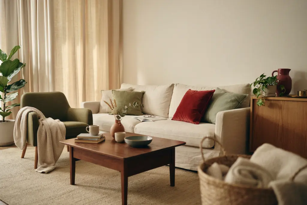
The 60-30-10 Rule
The classic 60-30-10 approach is still a useful starting point.
Use approximately:
60%: Main color
30%: Secondary color
10%: Accent color
For example:
60% warm cream
30% olive green
10% wine red
This creates a balanced room where the stronger colors have enough presence without taking over.
Another combination could be:
60% oatmeal
30% chocolate brown
10% smoky blue
Or:
60% warm beige
30% layered greens
10% burgundy
Small Living Room Ideas
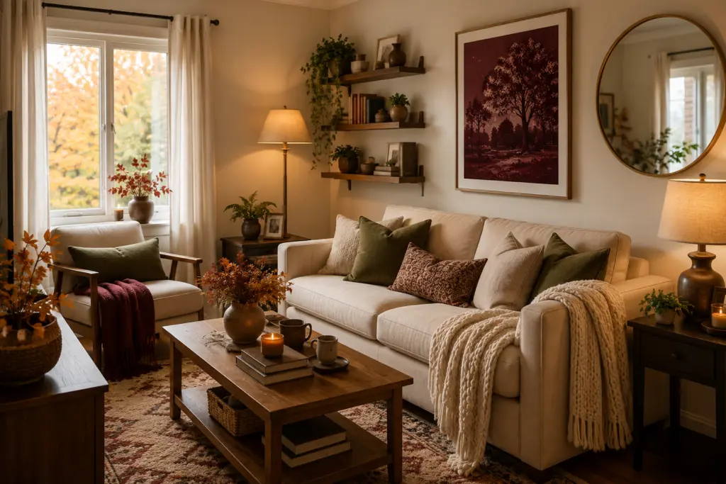
Small living rooms benefit from lighter foundation colors.
Keep walls and larger furniture relatively light, then introduce deeper shades through accessories.
For example:
- Cream walls
- Beige sofa
- Olive cushions
- Burgundy artwork
- Wooden coffee table
This creates contrast while keeping the room visually open.
Mirrors can also help reflect natural light, especially when you’re using deeper colors.
Large Living Room Ideas
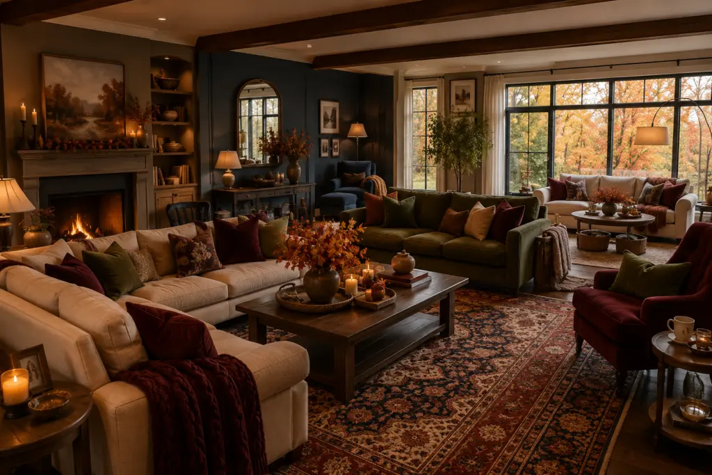
Large living rooms give you more freedom to experiment.
You can use a darker accent wall, oversized patterned rug or richly colored sofa without overwhelming the space.
Try creating separate color zones.
A smoky-blue reading corner can sit beside an olive-green seating area, while burgundy accessories connect both sides.
This makes a large room feel intentional rather than empty.
Quick Fall 2026 Color Palette Guide
| Color Trend | Mood | Best With | Best Use |
| Wine Red | Elegant and intimate | Cream, olive, brown | Accent pieces |
| Olive Green | Natural and sophisticated | Beige, wood, brass | Walls and furniture |
| Layered Greens | Organic and collected | Natural textures | Whole-room palettes |
| Burgundy | Dramatic and luxurious | Cream, walnut, brass | Statement accents |
| Smoky Blue | Calm and sophisticated | Oak, cream, camel | Walls or seating |
| Chocolate Brown | Cozy and grounded | Oatmeal, cream | Sofa and furniture |
| Warm Cream | Soft and timeless | Almost everything | Main foundation |
| Burnt Terracotta | Earthy and welcoming | Olive, beige, brown | Accessories |
How to Make These Trends Feel Timeless
Trends can be exciting, but you don’t want your living room to look outdated next year.
The easiest strategy is to keep expensive pieces relatively timeless.
Choose a neutral sofa, classic wooden furniture and versatile curtains. Then bring seasonal trends through items that are easy to replace.
Cushions, blankets, artwork, vases and rugs are ideal.
This approach also allows you to experiment.
If you fall in love with wine red this autumn, you can use it heavily. If your preferences change next year, you can switch to another accent color without replacing the entire room.
A timeless interior isn’t necessarily one without trends. It’s a room where trends are used thoughtfully.
FAQs
What is the most popular living room color for fall 2026?
Rich earthy shades are among the strongest choices for fall 2026, particularly wine red, olive green, burgundy, chocolate brown and warm cream. These colors create depth while maintaining a comfortable atmosphere.
Is burgundy still trendy for living rooms in 2026?
Yes. Burgundy remains a strong choice for homeowners looking for a dramatic and sophisticated accent. It works especially well with cream, walnut wood, beige and brass.
What green is trending for fall 2026?
Olive green and layered green palettes are particularly versatile. Instead of relying on one bright green, combining muted sage, olive, moss and deeper forest shades creates a more sophisticated look.
What is the best neutral for a fall living room?
Warm cream and oatmeal are excellent choices. They’re softer than stark white and work beautifully with rich autumn shades such as burgundy, wine red, terracotta and chocolate brown.
What colors make a living room feel cozy?
Warm cream, chocolate brown, wine red, burgundy, olive and terracotta can all create a cozy feeling. Texture is equally important, so combine colors with wool, velvet, linen, boucle and natural wood.
Can I use dark colors in a small living room?
Absolutely. The key is balance. Use a dark shade as an accent rather than covering every surface, and combine it with lighter colors, mirrors and good lighting.
What colors go well with olive green?
Olive green pairs beautifully with warm cream, beige, oatmeal, chocolate brown, natural wood, brass and muted terracotta. Wine red can also create a richer, more dramatic combination.
The fall 2026 living room color trends are all about warmth, depth and personality. Instead of relying on one predictable neutral, today’s interiors are embracing richer combinations that feel collected and comfortable.
Use these fall 2026 color trends as inspiration rather than strict rules. The best living room is one that reflects your personality, feels comfortable and works naturally with the light, furniture and materials already in your home.