When it comes to creating a harmonious and visually appealing interior design, understanding the color wheel can be your secret weapon. Colors play a crucial role in setting the mood, enhancing the aesthetics, and creating a cohesive atmosphere in any space. In this article, we will delve into the fascinating world of the color wheel and explore how you can use it effectively in your interior design projects. Whether you’re a seasoned designer or a DIY enthusiast, mastering the art of color selection can transform your living spaces.
Table of Contents
The Basics of the Color Wheel
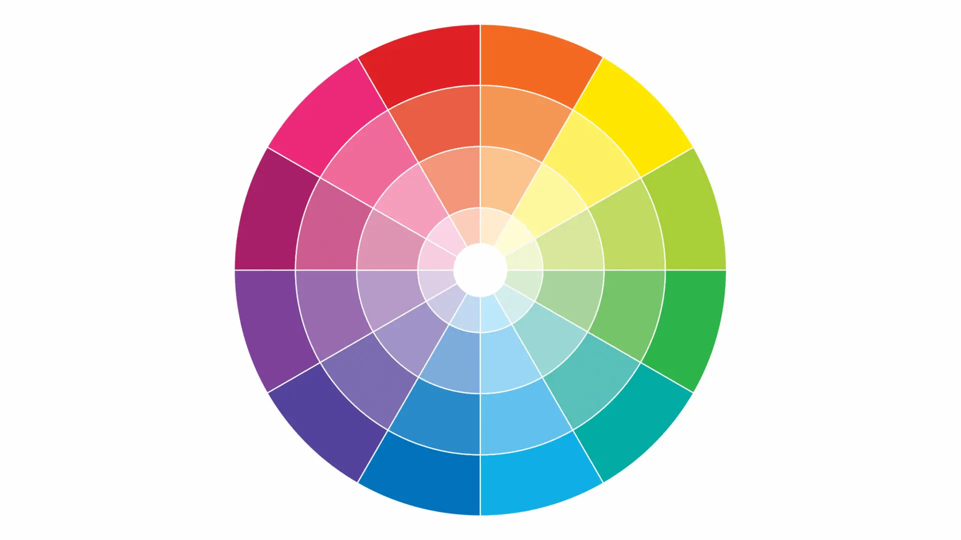
Before we dive into the practical aspects of using the color wheel, let’s start with the basics. The color wheel is a visual representation of colors arranged in a circular format. It consists of primary colors, secondary colors, and tertiary colors, all strategically positioned to help you create stunning color schemes.
Primary Colors
- Red
- Blue
- Yellow
Secondary Colors
- Green (mix of blue and yellow)
- Orange (mix of red and yellow)
- Purple (mix of red and blue)
Tertiary Colors
Tertiary colors are created by mixing a primary color with a neighboring secondary color. These colors offer a wider range of choices for your interior design projects.
Color Relationships
An 8-color wheel helps artists and designers understand how these colors relate to each other. Complementary, analogous, and triadic color schemes can be derived from this wheel, aiding in creating visually appealing compositions.
Applications
An 8-color wheel is a useful tool for selecting colors for various purposes, such as graphic design, interior decorating, and fashion design, ensuring that the chosen colors harmonize well together.
Creating Color Harmony
One of the primary uses of the color wheel in interior design is to create color harmony. Harmony ensures that the colors in your space work well together, evoking the desired emotions and ambiance. Here are some techniques to achieve color harmony:
Complementary Colors
Complementary colors are positioned opposite each other on the color wheel. When used together, they create a striking contrast that adds vibrancy to your design. For example, pairing blue and orange or red and green can create a visually appealing balance.
Analogous Colors
Analogous colors sit next to each other on the color wheel and share similar undertones. This creates a seamless and soothing look, making it ideal for creating a calm and cohesive atmosphere in your interior spaces.
Triadic Colors
Triadic colors are evenly spaced around the color wheel, creating a balanced and dynamic color scheme. Using three equidistant colors can inject energy and interest into your design while maintaining harmony.
The 60-30-10 Rule
To ensure that your color choices are well-balanced and visually appealing, consider the 60-30-10 rule. This guideline suggests allocating 60% of your room’s color to a dominant color, 30% to a secondary color, and 10% to an accent color. This balance ensures that no color overwhelms the space while still adding personality.
Practical Tips for Using the Color Wheel
Now that you have a solid understanding of the color wheel and how it contributes to harmony in your interior design, here are some practical tips to apply this knowledge effectively:
1. Start with a Neutral Base
Begin with a neutral base color, such as white, beige, or gray, and build your color scheme from there. Neutrals provide a versatile canvas for experimenting with other colors.
2. Test Color Swatches
Before committing to a paint color or furniture piece, test color swatches in your space to see how they interact with the lighting and other elements in the room.
3. Use Color in Layers
Layering colors through various elements like walls, furniture, accessories, and artwork adds depth and complexity to your design.
4. Consider the Psychology of Color
Keep in mind that different colors evoke different emotions. For example, blue is calming, while red is energizing. Use this knowledge to create the desired atmosphere in each room.
5. Balance Warm and Cool Tones
Balance warm colors (reds, oranges, yellows) with cool colors (blues, greens, purples) to create a sense of equilibrium in your design.
6. Personalize Your Color Choices
Your home should reflect your personality and taste. While the color wheel provides a structured approach, don’t be afraid to inject your unique style into your color choices. Consider incorporating your favorite colors or hues that hold sentimental value to you. This personal touch can make your space feel truly yours.
7. Create Visual Flow
The color wheel isn’t just about individual color choices; it also helps you create a sense of flow and connection between different areas of your home. When planning your color scheme, think about how colors will transition from one room to another. Gradual shifts in color tones can create a harmonious flow throughout your home.
8. Pay Attention to Lighting
Lighting can significantly influence how colors appear in a room. Natural daylight, warm incandescent lighting, and cool LED lighting can all affect the perceived color. Be sure to test your chosen colors under various lighting conditions to ensure they maintain their desired look.
9. Experiment with Textures
Don’t limit your creativity to flat colors alone. Experiment with textures and finishes to add depth to your design. For instance, a glossy finish on a cabinet can catch and reflect light differently from a matte wall, creating intriguing visual contrasts.
10. Consider the Function of the Room
Each room in your home serves a unique purpose, and the color choices should align with that function. For example, soothing, cool colors like blues and greens are excellent for bedrooms, while vibrant, warm colors like reds and oranges can energize a dining or living area.
11. Embrace Trends with Caution
While it’s fun to stay updated with the latest color trends, remember that trends come and go. Instead of completely overhauling your space with trendy colors, use them as accents or temporary updates. This way, your design remains timeless, and you can easily refresh your space as trends evolve.
12. Seek Professional Advice
If you’re unsure about color choices or are tackling a large-scale design project, consider consulting with a professional interior designer. They can provide expert guidance, ensuring your color selections align with your vision and goals.
The color wheel is a powerful tool that can elevate your interior design projects from ordinary to extraordinary. By understanding the principles of color theory and experimenting with different color schemes, you can create spaces that are not only visually stunning but also reflect your unique style and personality.
Now, it’s time to unleash your creativity and embark on a colorful journey in interior design. Whether you prefer the calming effect of analogous colors or the bold contrast of complementary colors, the color wheel is your guide to crafting spaces that truly shine.
FAQs
Can I use the color wheel for any room in my home?
Absolutely! The color wheel can be applied to any room, from your living room to your kitchen or bedroom. It’s a versatile tool for creating harmonious color schemes.
What if I’m not confident in my color choices?
Start small. Experiment with throw pillows, artwork, or accent pieces in your chosen colors before making a big commitment like painting the walls.
Are there any colors I should avoid using together?
While there are no strict rules, some color combinations can be challenging to work with, such as two complementary colors in high saturation. However, with the right balance and understanding, even these combinations can be used effectively.
How do I incorporate the 60-30-10 rule into my design?
Begin by selecting your dominant color (60%), followed by your secondary color (30%) for larger elements like furniture. Finally, use your accent color (10%) in smaller details like decor and accessories.
Where can I find inspiration for color schemes?
You can find inspiration in interior design magazines, online platforms like Pinterest, or even by observing nature. Don’t hesitate to take cues from the world around you to create stunning color combinations in your home.
What are the 12 Colour wheel?
The 12-color wheel typically includes primary, secondary, and tertiary colors, creating a full spectrum for color mixing.
What are the 2 best colors that go together?
The best color combinations depend on personal preferences and the context, but classic pairs often include blue and white, or red and black.
How do you use a color wheel?
Use a color wheel to understand color relationships, select color schemes, and create harmonious designs.
How color wheel is helpful in designing?
The color wheel is helpful in designing by providing a visual guide to combining and contrasting colors effectively, ensuring a balanced and pleasing aesthetic.
What is the purpose of color wheels and how they are relevant to interior decoration?
Color wheels serve the purpose of helping interior decorators choose color palettes, coordinate furnishings, and create visually appealing and cohesive spaces. They are a valuable tool in achieving harmony in interior design.
What colors compliment each other?
Complementary colors are opposites on the color wheel, like red and green or blue and orange.
Which colors suits me?
The colors that suit you depend on your skin tone, personal style, and color theory, so it’s best to experiment and find what works best for you.
