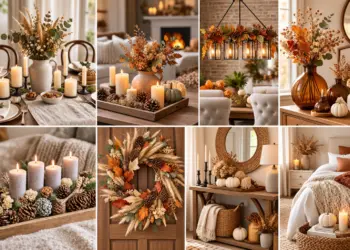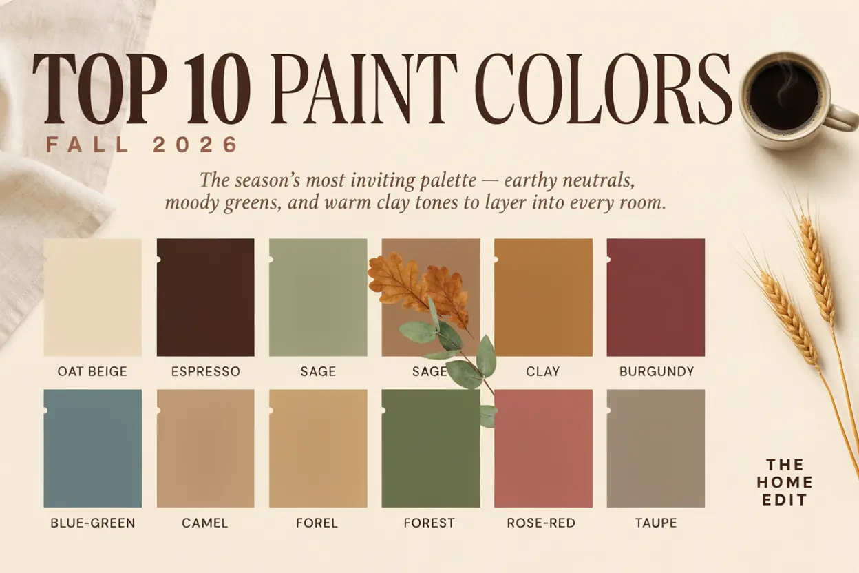
As the seasons change, our homes naturally begin to call for richer textures, warmer lighting, and more comforting colors. For fall 2026, paint trends are moving beyond predictable orange and yellow shades and embracing earthy neutrals, deep browns, sophisticated greens, muted reds, warm clay tones, and moody blue-greens.
We have gathered the 10 best 2026 fall paint colors to consider when creating a warm and cozy home, whether we are refreshing a living room, bedroom, kitchen, dining room, entryway, or home office.
For more fall 2026 trends chuck our Tiered Tray Fall Decor Ideas, Fall Bedroom Decor Ideas in 2026, Cozy Living Room Lighting Ideas for Fall 2026.
Table of Contents
1. Universal Khaki by Sherwin-Williams
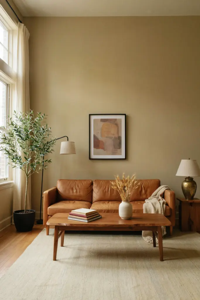
Universal Khaki SW 6150 is one of the most versatile fall paint colors for 2026. Sherwin-Williams selected this warm neutral as its 2026 Color of the Year, describing it as a mid-tone shade with a subtle yellow undertone and an emphasis on livability and longevity.
What makes Universal Khaki especially appealing for fall is its ability to create warmth without becoming too dark. It works beautifully with cream, natural wood, black accents, aged brass, leather, and woven textures.
We can use it throughout an open-concept home or choose it for a living room where we want a calm, sophisticated backdrop.
Best rooms: Living room, hallway, bedroom, dining room, kitchen.
Pair it with: Creamy white, walnut wood, camel leather, matte black, brass.
2. Silhouette AF-655 by Benjamin Moore
For a deeper and moodier interpretation of fall, Benjamin Moore Silhouette AF-655 is one of the strongest choices for 2026.
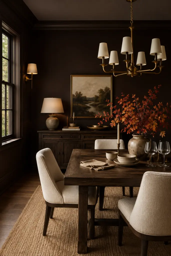
Silhouette was named Benjamin Moore’s 2026 Color of the Year and combines rich espresso-brown qualities with subtle charcoal undertones. The result is a sophisticated brown that feels dramatic while remaining surprisingly elegant.
Brown is becoming increasingly important in interiors because it adds depth and warmth without the starkness that some darker colors can create. Silhouette works particularly well in rooms with natural wood, cream upholstery, stone surfaces, and warm metallic finishes.
For a cozy fall look, we can use it on all four walls and introduce lighter furniture to prevent the room from feeling heavy.
Best rooms: Dining room, study, bedroom, library, accent wall.
Pair it with: Warm ivory, tan, caramel, cognac leather, antique brass.
3. Warm Mahogany by PPG
Rich red-brown colors are another major direction for fall 2026. PPG selected Warm Mahogany as its 2026 Color of the Year, describing it as a grounded red that is bold while still intended to have timeless appeal.
This shade sits beautifully between deep red, brown, and burgundy, making it ideal for creating an intimate atmosphere.
Warm Mahogany can transform a dining room into a dramatic entertaining space or add character to a home office. Rather than treating it like a traditional holiday red, we can balance it with muted neutrals and natural materials.
Best rooms: Dining room, office, powder room, bedroom.
Pair it with: Oatmeal, warm white, dark wood, aged brass, beige.
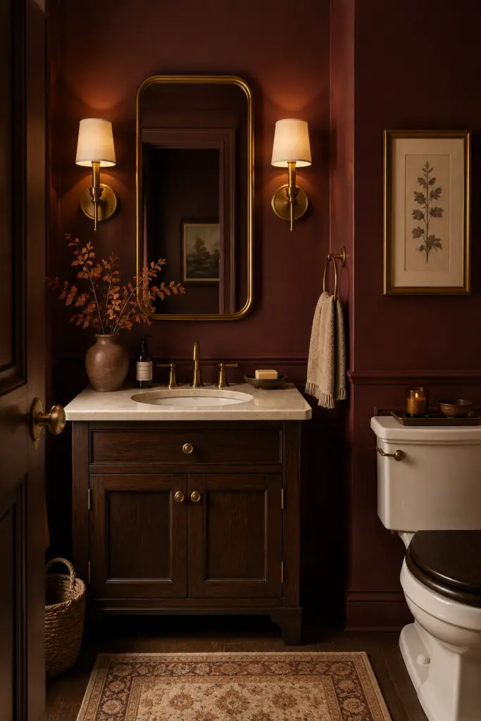
4. Hidden Gem by Behr
Hidden Gem N430-6A is Behr’s 2026 Color of the Year. This smoky jade combines blue and green to create a rich, sophisticated color with both depth and tranquility.
Although green and blue may not immediately come to mind when we think about fall, this shade works exceptionally well with autumn materials. Think rust-colored textiles, walnut furniture, camel leather, creamy upholstery, and warm wood floors.
Behr also demonstrates Hidden Gem in living rooms, bedrooms, bathrooms, kitchens, and home offices, showing how adaptable the color can be.
For a dramatic effect, we can use Hidden Gem for color drenching, painting the walls, trim, and selected built-ins in the same color.
Best rooms: Bedroom, office, living room, bathroom.
Pair it with: Rust, camel, cream, walnut, bronze.
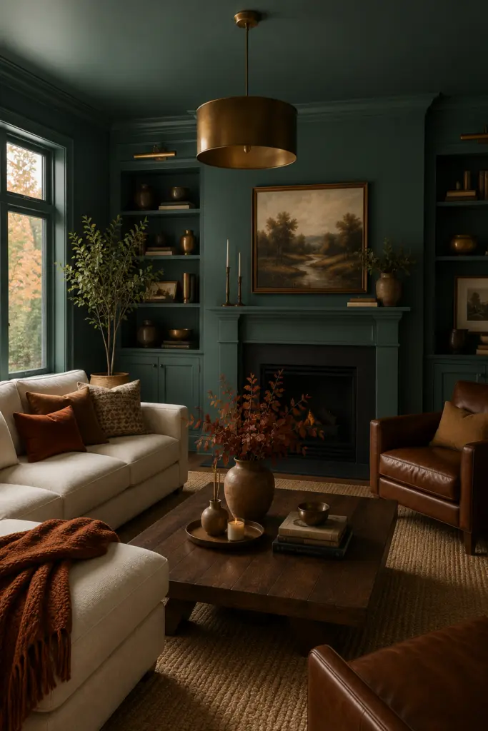
5. Narragansett Green by Benjamin Moore
Deep green continues to be an important choice for homeowners who want a connection to nature while creating a cozy atmosphere.
Benjamin Moore Narragansett Green HC-157 is included in the brand’s official 2026 Color Trends palette, alongside Silhouette, Southwest Pottery, Sherwood Tan, Batik, and other sophisticated shades.
This is the kind of green that feels particularly effective in fall because it works naturally with wood, stone, leather, linen, and aged metals.
We can use it as a full wall color in a cozy bedroom or as a dramatic kitchen cabinet color. It is also an excellent choice for a small room where we want personality rather than maximum brightness.
Best rooms: Kitchen, bedroom, study, dining room, mudroom.
Pair it with: Cream, warm beige, oak, walnut, terracotta.
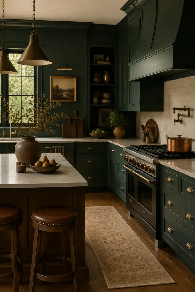
6. Southwest Pottery by Benjamin Moore
For homeowners who want the warmth of autumn without using a traditional orange, Southwest Pottery 048 offers a sophisticated alternative.
Southwest Pottery is part of the Benjamin Moore Color Trends 2026 palette, which emphasizes layered, refined colors with a balance between lighter hues and grounded mid-tones.
Its earthy character makes it particularly appealing for spaces inspired by Southwestern, Mediterranean, organic modern, rustic, and vintage interiors.
We can use this type of warm clay shade on an accent wall, throughout a dining room, or on cabinetry for a stronger statement.
Best rooms: Dining room, kitchen, entryway, living room.
Pair it with: Soft cream, olive green, natural wood, terracotta, woven textures.
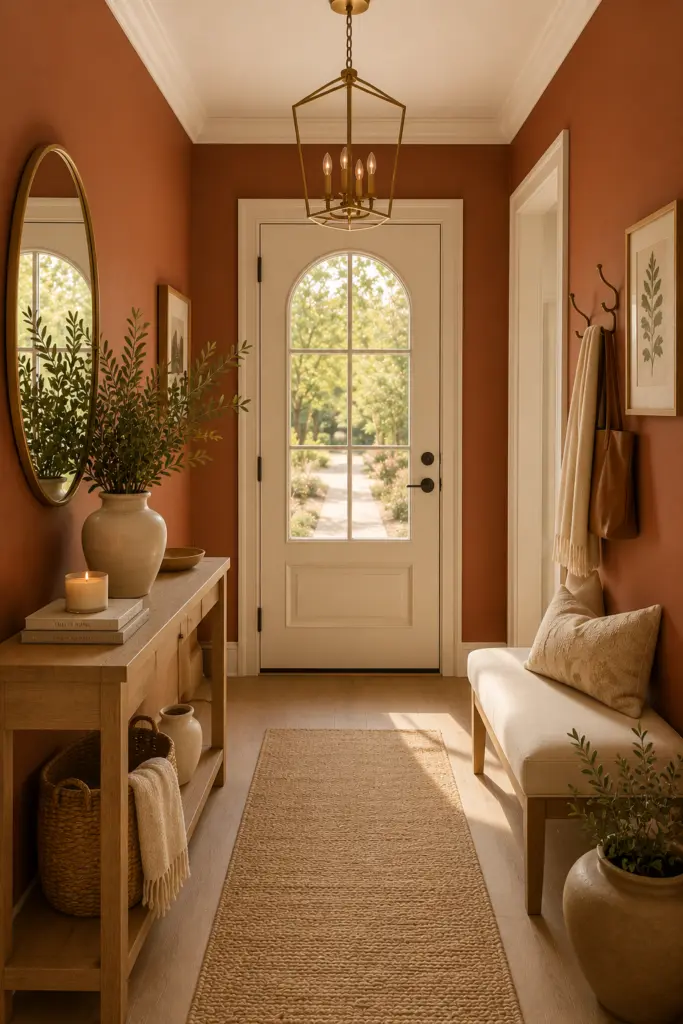
7. Sherwood Tan by Benjamin Moore
Not every cozy fall color needs to be bold. Sherwood Tan 1054 offers a warmer, more understated way to bring autumn into the home.
Sherwood Tan is another shade included in Benjamin Moore’s 2026 Color Trends palette.
Warm tan shades are particularly useful because they can act as a whole-home neutral while still feeling richer than cool gray or stark white.
We can use Sherwood Tan on walls and add contrast with dark brown furniture, creamy textiles, green plants, and black or brass hardware.
Best rooms: Whole home, hallway, bedroom, living room, kitchen.
Pair it with: Espresso brown, ivory, olive, black, natural oak.
8. Batik by Benjamin Moore
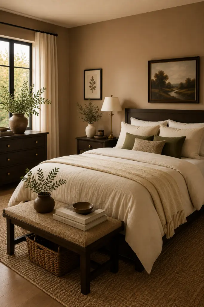
Batik AF-610 is a beautiful choice when we want something warmer and more colorful than a traditional beige.
It belongs to Benjamin Moore’s 2026 palette, which was designed around a sophisticated combination of graceful pales and deeper, handsome mid-tones.
Batik works particularly well in rooms filled with natural materials. Its warmth can make wood floors, woven baskets, linen curtains, and leather furniture feel even more cohesive.
This makes it a strong option for homeowners who want fall-inspired warmth without committing to a very dark wall color.
Best rooms: Living room, bedroom, kitchen, hallway.
Pair it with: Cream, dark brown, muted green, natural wood.
9. Oxblood and Deep Burgundy
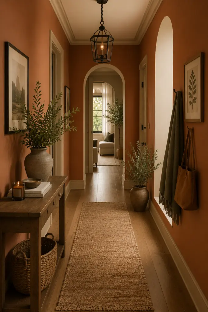
One of the biggest visual directions for fall 2026 interiors is the return of saturated reds. Current fall design forecasts highlight oxblood, burgundy, maroon, and other complex red tones as ways to create warmth and personality.
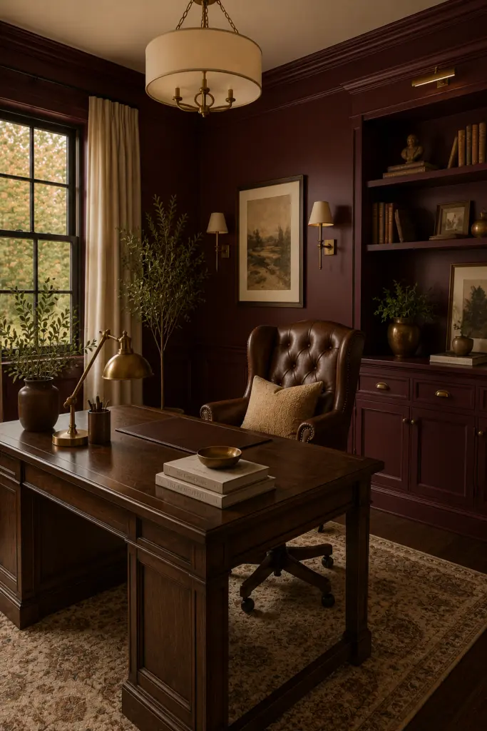
Unlike bright red, oxblood has enough brown and depth to feel sophisticated. It can make a room feel intimate, traditional, luxurious, and slightly dramatic.
We can use an oxblood-inspired shade on a small powder room, dining room walls, built-ins, cabinetry, or a feature wall. In larger spaces, balancing the color with light upholstery and warm neutrals keeps the look elegant.
Best rooms: Dining room, powder room, library, bedroom, office.
Pair it with: Soft beige, ivory, chocolate brown, brass, walnut.
10. Chocolate Brown
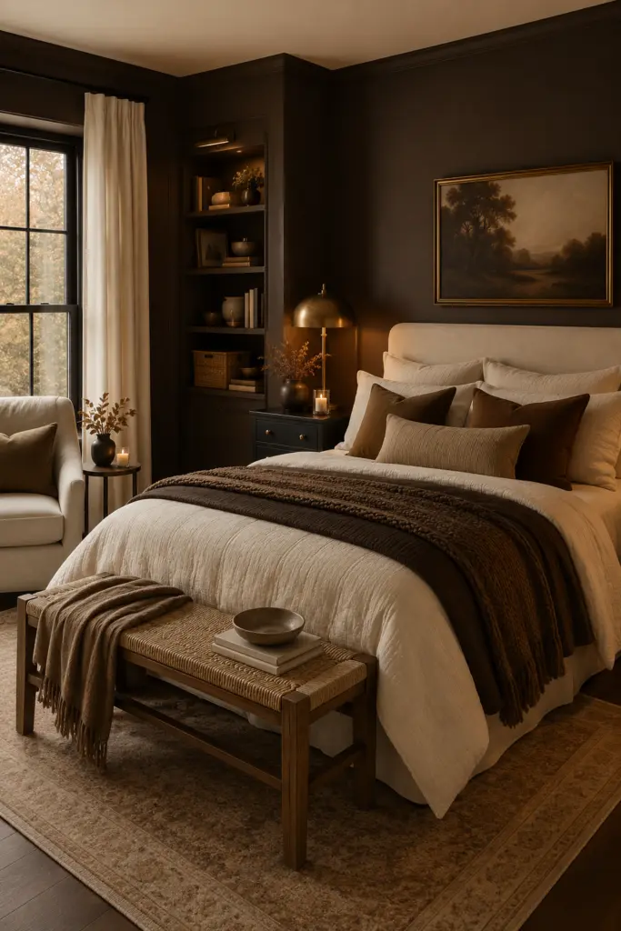
Chocolate brown is one of the easiest ways to capture the cozy side of 2026’s fall color direction.
Current 2026 fall design forecasts are pointing toward deep brown and chocolate tones as important alternatives to cooler grays and overly neutral interiors. Benjamin Moore’s choice of Silhouette and the continued emphasis on richer brown families reinforce the broader move toward deeper earthy colors.
A chocolate-brown wall can instantly make a space feel enveloping. It is particularly beautiful in rooms with cream sofas, warm lighting, antique furniture, woven textiles, and natural wood.
For a less dramatic approach, we can use chocolate brown on cabinetry, doors, a fireplace wall, or built-in shelving.
Best rooms: Bedroom, living room, dining room, office, kitchen.
Pair it with: Cream, caramel, tan, warm white, brass.
How to Choose the Best Fall Paint Colors for Your Home
Choosing among the many beautiful fall paint colors becomes easier when we consider the existing elements of the room.
Consider Natural Light
A south-facing room may handle deeper colors beautifully, while a north-facing room can make some shades appear darker or cooler. Before committing, we should always test a paint sample directly on the wall and observe it throughout the day.
Morning light, afternoon sunlight, evening lamps, and cloudy conditions can all change how a color appears.
Look at Your Flooring
The undertones of hardwood, tile, stone, or carpet matter enormously. Warm paint colors generally work best when their undertones complement the flooring rather than compete with it.
For example, warm khaki, tan, brown, and terracotta can look especially cohesive with oak and walnut flooring.
Use the 60-30-10 Approach
A simple way to build a cohesive fall palette is to think in three layers:
60%: Main wall color
30%: Furniture, cabinetry, curtains, or secondary colors
10%: Accent colors through artwork, pillows, lamps, and accessories
This allows stronger colors such as oxblood, deep green, or chocolate brown to make an impact without overwhelming the room.
The Best Fall Color Combinations for 2026
Some of the most beautiful combinations come from mixing warm neutrals with deeper statement colors.
Universal Khaki + Chocolate Brown + Cream creates an elegant organic-neutral palette.
Silhouette + Warm White + Camel creates a sophisticated, cocoon-like atmosphere.
Hidden Gem + Rust + Walnut brings together blue-green depth and classic autumn warmth.
Narragansett Green + Southwest Pottery + Cream creates a natural, earthy palette.
Oxblood + Sherwood Tan + Brass creates an elevated traditional look.
Warm Mahogany + Beige + Dark Wood produces an intimate and luxurious dining-room palette.
Should We Paint the Whole Room or Just an Accent Wall?
There is no need to limit dramatic fall paint colors to one wall. In 2026, more immersive applications are becoming increasingly appealing, particularly when using sophisticated colors with enough complexity to work across multiple surfaces.
Color drenching can make a room feel intentional by extending one shade across walls, trim, doors, cabinetry, and sometimes the ceiling.
For darker shades such as Silhouette, Hidden Gem, deep green, oxblood, or chocolate brown, color drenching can create a particularly cozy effect.
For a safer approach, we can keep the main walls neutral and use a stronger fall color on cabinetry, an accent wall, a fireplace, built-ins, or interior doors.
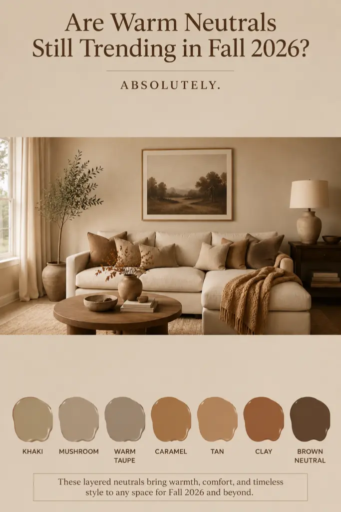
Are Warm Neutrals Still Trending in Fall 2026?
Absolutely. Warm neutrals remain a major part of the 2026 color conversation. Sherwin-Williams selected Universal Khaki as its 2026 Color of the Year, while other major palettes are also incorporating earthy and warm tones.
The difference is that today’s warm neutrals are more nuanced. Instead of relying only on plain beige, we are seeing khaki, mushroom, warm taupe, caramel, tan, clay, and brown-based neutrals that create more depth.
The best fall paint colors for 2026 are warmer, richer, and more sophisticated than the traditional seasonal palette. Instead of decorating exclusively with pumpkin orange and golden yellow, we can create a timeless autumn-inspired home with warm khaki, espresso brown, smoky jade, deep green, clay, mahogany, burgundy, tan, and chocolate.
The most successful approach is to choose a color that works with the home’s existing light, flooring, furniture, wood tones, and architectural details. When those elements are layered thoughtfully, even a bold fall color can feel timeless rather than temporary.